








Why Modern Devices Are Becoming Easier to Use—and Harder to Understand
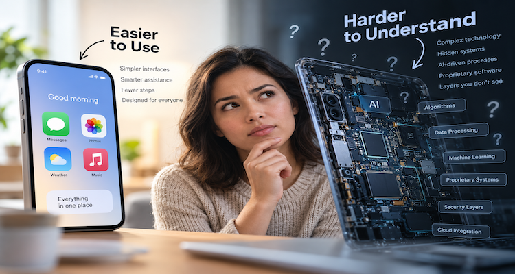
The modern smartphone can translate speech, identify objects through a camera, adjust accessibility settings to individual needs, manage passwords, filter notifications, control smart-home devices and increasingly anticipate what a user wants to do next. Much of this happens without requiring the user to understand how the underlying technology works.
That is a remarkable achievement in interface design. But it creates an unusual trade-off: devices can become easier to operate while becoming harder to understand.
The difference matters. A person may know exactly which icon to tap to accomplish something without knowing where the setting lives, what permissions are involved, why the device behaved differently this time, or what happened behind the interface. Modern software increasingly hides complexity so that everyday tasks feel simple. When that hiding works, users benefit. When something unexpected happens, however, the missing understanding can become a problem.
Key Takeaways
- Modern interfaces hide technical complexity so common tasks require less knowledge and fewer decisions.
- Features such as accessibility and automation expand what devices can do without necessarily making their underlying systems easier to understand.
- Privacy controls illustrate the growing gap between simple actions and complicated systems operating behind them.
- Progressive disclosure can reduce interface clutter, but excessive hiding can make important functions difficult to discover.
- The real usability challenge is not eliminating complexity but revealing the right complexity at the right moment.
The Disappearing Complexity Behind Everyday Tasks
Consider something as ordinary as changing the appearance of a smartphone.
On current iPhones, users can customize Control Center, rearrange controls and add additional functions. Accessibility features can also be activated through shortcuts, Control Center, Siri or physical-button actions.
On Android, users can adjust text and display size, use magnification, change contrast, activate screen readers, use voice controls and access a dedicated Accessibility Menu.
From the user’s perspective, these are relatively simple actions.
Underneath them, however, are sophisticated operating-system services, permission systems, hardware interfaces, accessibility frameworks and application-specific behaviors.
That is the paradox.
The interface becomes simpler partly because the system underneath has become more complicated.
This is not necessarily bad design. In fact, hiding technical complexity is one of the foundations of successful consumer technology. Most people should not need to understand a device’s operating-system architecture before they can increase the font size.
The problem emerges when users need to move beyond the ordinary path.
Why Simplicity Works Until Something Goes Wrong
Good interface design has long recognized the tension between capability and simplicity.
Nielsen Norman Group describes a principle called progressive disclosure, in which frequently needed functions are presented first while advanced or less frequently used options are moved to secondary screens. The approach is intended to make systems easier to learn and reduce errors without eliminating advanced functionality.
This principle explains much of the modern device experience.
A camera app does not begin by showing every computational photography option. A smartphone does not expose every networking parameter on its home screen. A television does not normally require users to configure its underlying operating system.
Instead, the device presents an approachable surface and keeps the machinery underneath it.
That is useful for everyday life.
But the same design creates what might be called a knowledge cliff.
A user can operate a device successfully for years while developing very little understanding of its deeper structure. Then one unusual notification, permission request, connectivity failure or unexpected setting change suddenly requires knowledge that the interface normally allows the user to avoid.
The device has not necessarily become less usable. The user has simply crossed from the simple layer into the complex layer.
The Feature Explosion Nobody Sees
Modern devices increasingly combine functions that once belonged to separate products.
A smartphone can be a camera, navigation system, payment device, communications terminal, entertainment platform, health and fitness interface, authentication tool, voice assistant and remote control for other devices.
Each capability creates additional settings, permissions, interactions and edge cases.
The complexity does not disappear because the manufacturer hides it.
It moves elsewhere.
Some of it moves into menus. Some moves into automated decisions. Some moves into cloud services. Some moves into app permissions. Some moves into interactions between applications.
This is why a device can feel remarkably straightforward during normal use while becoming surprisingly difficult to troubleshoot.
Nielsen Norman Group’s research on feature richness makes a related point: adding features can make interfaces more complicated because menus grow, documentation expands and the number of possible user errors increases.
The challenge for manufacturers is therefore not simply deciding which features to build.
It is deciding which complexity users should see, which complexity should remain hidden, and how users can reach the hidden layer when they need it.
Privacy Is a Good Example of Hidden Complexity
Privacy settings demonstrate the problem particularly well.
Android’s Privacy Dashboard lets users see which apps have accessed certain permissions and when that access occurred. Users can also manage permissions for sensitive capabilities such as the camera and microphone.
Android’s permission architecture itself is more complicated than a simple “allow or deny” model. Depending on the permission and operating-system version, users may encounter choices such as allowing access only while an application is being used, asking every time or denying access.
The interface attempts to make this manageable.
But understanding the implications requires more knowledge.
For example, knowing that an app has requested microphone access is different from understanding exactly when the app can use that access, why it needs it, what the operating system records about the access and how the application’s own data practices work.
The same pattern appears across modern technology: the control may be simple even when the system being controlled is not.
Accessibility Shows the More Positive Side of Complexity
There is another side to this story.
More complexity can produce a substantially more adaptable device.
Apple’s current iPhone documentation describes accessibility features covering vision, hearing, mobility, speech and cognitive needs. These include tools such as Voice Control, Eye Tracking, AssistiveTouch, larger text, screen-reading functions and simplified interfaces.
Apple also provides Assistive Access, which can simplify the iPhone interface for people who need a more focused experience.
Android similarly provides accessibility tools covering vision, hearing, mobility, voice and cognitive use cases.
Here, greater underlying complexity can produce a simpler personal experience.
A user does not necessarily need to understand every accessibility framework. They simply need the feature that makes the device work better for them.
This reveals an important distinction:
A complicated system and a complicated user experience are not the same thing.
The engineering can become vastly more sophisticated while the experience becomes easier.
The challenge is ensuring that the sophistication does not become invisible when users need to understand or control it.
The Discoverability Problem
There is also a cost to hiding too much.
Research from Nielsen Norman Group found that hiding primary navigation can reduce discoverability and increase task difficulty and completion time. In its study of hidden versus visible navigation, users were less likely to use hidden navigation and tended to access it later.
The lesson extends beyond hamburger menus.
If a useful function exists but users cannot discover that it exists, its technical availability does not automatically translate into practical usefulness.
This is particularly important as interfaces become increasingly gesture-based, context-sensitive and personalized.
A visible button teaches the user something.
A hidden gesture may save screen space.
An automatically triggered feature may save effort.
But each can also reduce the user’s understanding of what the system is capable of doing.
That creates a design balancing act between simplicity, discoverability and control.
AI Is Pushing the Paradox Further
Artificial intelligence adds another layer.
Traditional software often requires users to understand a sequence: select an option, enter information, choose a setting and execute an action.
AI-driven interfaces increasingly allow users to express an intention in ordinary language.
That can dramatically reduce the number of controls users need to learn.
But it can also make the system less predictable.
When a user selects a conventional setting, there is usually a relatively clear relationship between the control and its outcome. When an AI system interprets a request, the result may depend on context, available data, model behavior and other system-level factors.
The interface may therefore become easier while the underlying mental model becomes harder.
This does not mean AI interfaces are inherently worse or better. It means their usability cannot be judged solely by counting how many buttons disappear.
A system can require fewer actions while demanding a deeper understanding when the result is unexpected.
What Better Device Design Could Look Like
The answer is not to expose every technical detail.
That would simply replace invisible complexity with overwhelming complexity.
A better approach is layered understanding.
Everyday users should be able to perform common tasks without unnecessary friction. But when they want an explanation, troubleshooting information or greater control, the system should provide a clear path into the deeper layer.
That means:
- Simple default experiences for common tasks.
- Clear explanations when an important automated action occurs.
- Settings that use understandable language rather than internal technical terminology.
- Visible paths to privacy, security and accessibility controls.
- Searchable settings that help users find functions they cannot remember.
- Useful explanations of permissions and system behavior.
- Advanced controls for users who actually need them.
The principle is similar to progressive disclosure, but with an important addition: the secondary layer must remain discoverable.
A simple device should not become a black box.
The New Definition of “Easy to Use”
For decades, technological progress was often measured by how much complexity could be removed from the user’s immediate experience.
That remains important.
But modern devices have reached a point where another measure deserves equal attention: how easily can users understand the system when understanding becomes necessary?
The best interface may not be the one that exposes the fewest controls.
It may be the one that gives people the simplest possible path during ordinary use while preserving a clear path to explanation, control and deeper understanding.
That distinction is becoming increasingly important as smartphones, computers, cars, appliances and AI systems absorb more functions.
Technology does not have to become simple internally to become simple externally.
But when the external simplicity becomes complete opacity, convenience can come at the cost of understanding.
The next generation of user experience therefore has a more difficult job than merely making devices easier to operate. It must make sophisticated systems easy enough to use and understandable enough to trust.
The information presented in this article is based on publicly available sources, reports, and factual material available at the time of publication. While efforts are made to ensure accuracy, details may change as new information emerges. The content is provided for general informational purposes only, and readers are advised to verify facts independently where necessary.